July 2021.
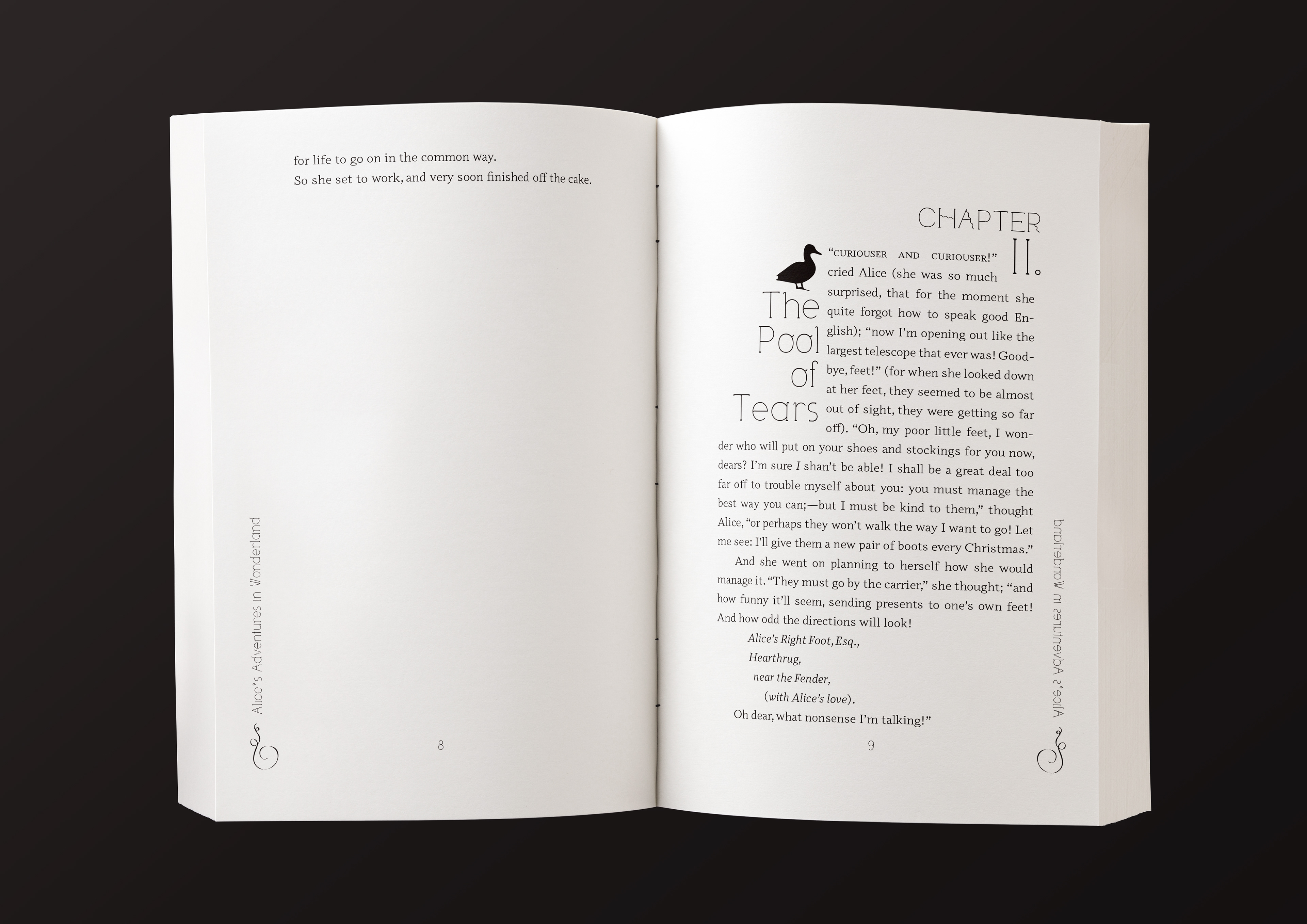
Alice's Adventures in Wonderland: the chapter headings push the text into unusual shapes, to fit with the style of some of the poems and the feeling of being in a land where everything is strange. Each chapter features the silhouette of a relevant animal, and the text on the side reflects, in case the reader wants to hold it up to a looking-glass...
November 2020.
A historical fiction set in the 1700s, the fonts and design were chosen to evoke a sense of history while still easy and subtle to the reader.
April 2021.
An urban fantasy story of a long civil war, in an ornate setting. I moved the header and footer content to the sides to reference oft-mentioned pillars and columns, as well as to enhance the feeling of a slightly altered reality.
January 2021.
A dark romance with a strong flower motif, I kept the suggestion of distorted and wilted florals on the chapter headings and page numbers. Set in Garamond to keep the light but sharp "daylight horror" feel, while also easily including special characters.
December 2020.
The text is a novel about arctic explorers in the mid-1800s. I set it in Caslon for the slightly more historical feel, and added the trident symbol to the chapter headings to suggest the sea. There is a Victorian-inspired wave design next to the page number.
September 2020.
We wanted to keep the tech-y, sci-fi feeling without falling into the "heavy square letters" trap. This was the third book in a science fiction space travel series.
"I gasped out loud when I looked at them!" - Reader
April 2017.
From a collection of folktales. This one is a Hindu story about a boy who ventures into a dark woods.
July 2022.
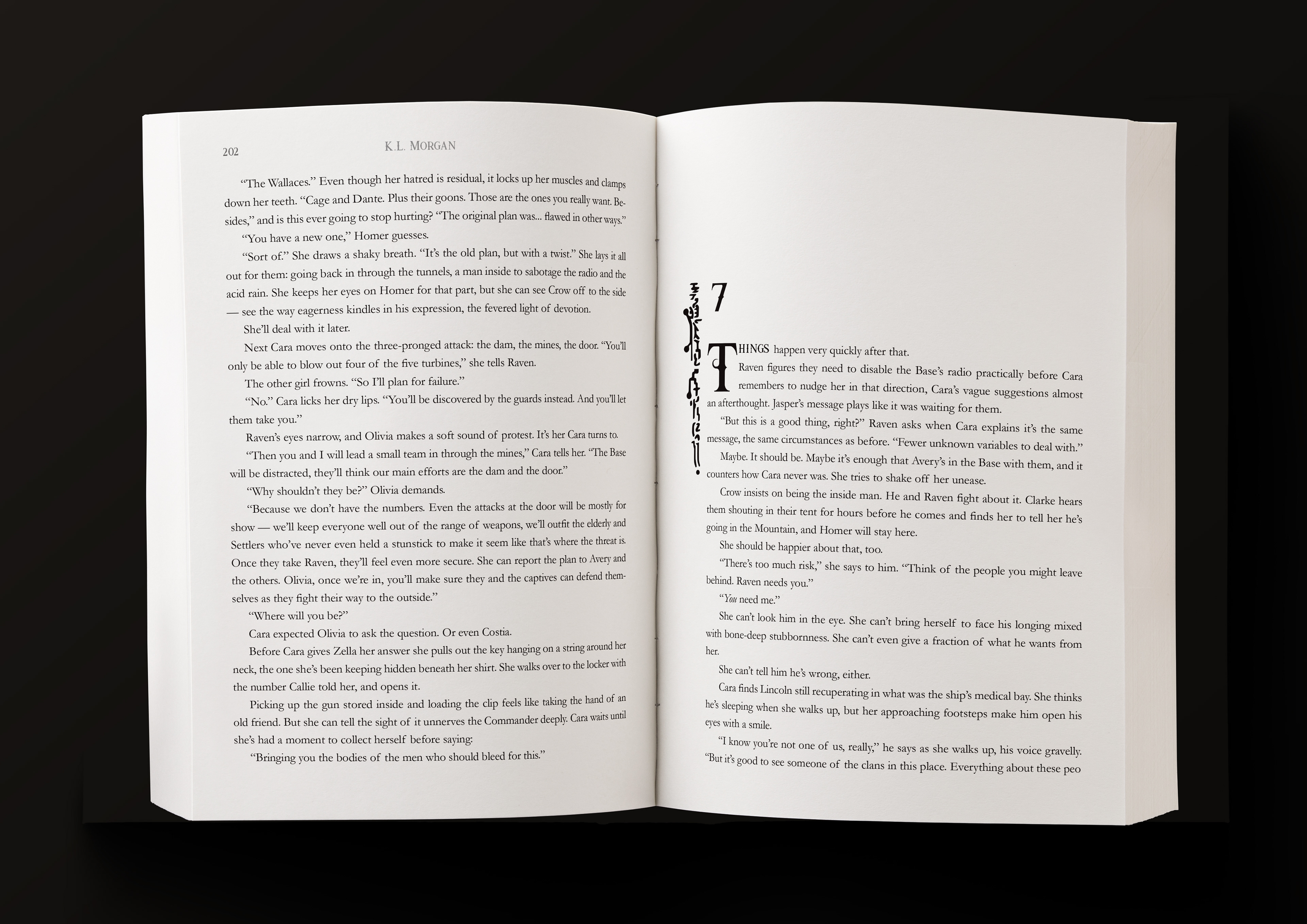
A post-apocalyptic science fiction story, balancing both futuristic and primitive technology. I kept a suggestion of both in the dropcap and graphic.
April 2021.
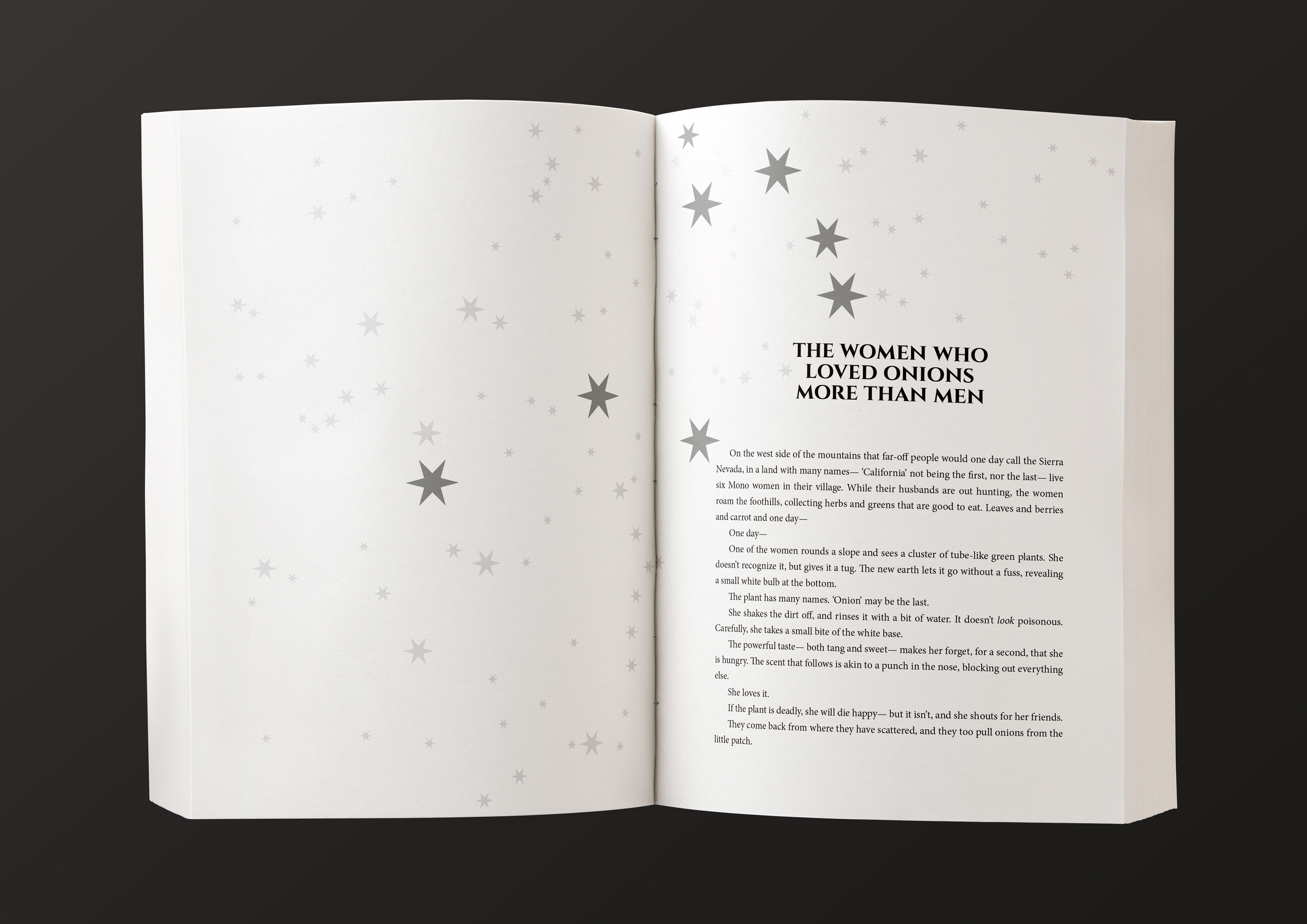
From a series of stories about constellations, this one tells of the Mono story of the Onion Women. A mostly-accurate star map covers both pages, although the constellation in question-- the Pleiades-- have been emphasized.

June 2020.
A romance set in the television industry, the film strip on each chapter contains motifs from the novel. Set to match the middle-aged characters making their way through a modern world that has changed around them.
"I specially like the chapter headers – they are fun and reflect the key moments and metaphors of the story." - Reviewer
June 2021.
The story was a dark office romance, set against the backdrop of ancient books and scrolls: the client wanted something both simple and unique. They were thrilled with the result.
February 2021.
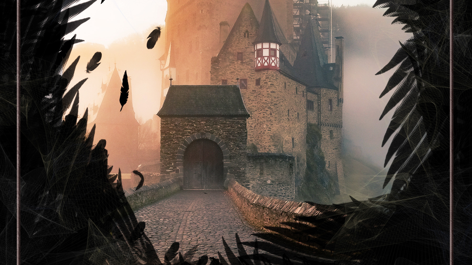
A dark romance in a Scottish setting.
"It looks STUNNING!" - Author
Fall 2021.
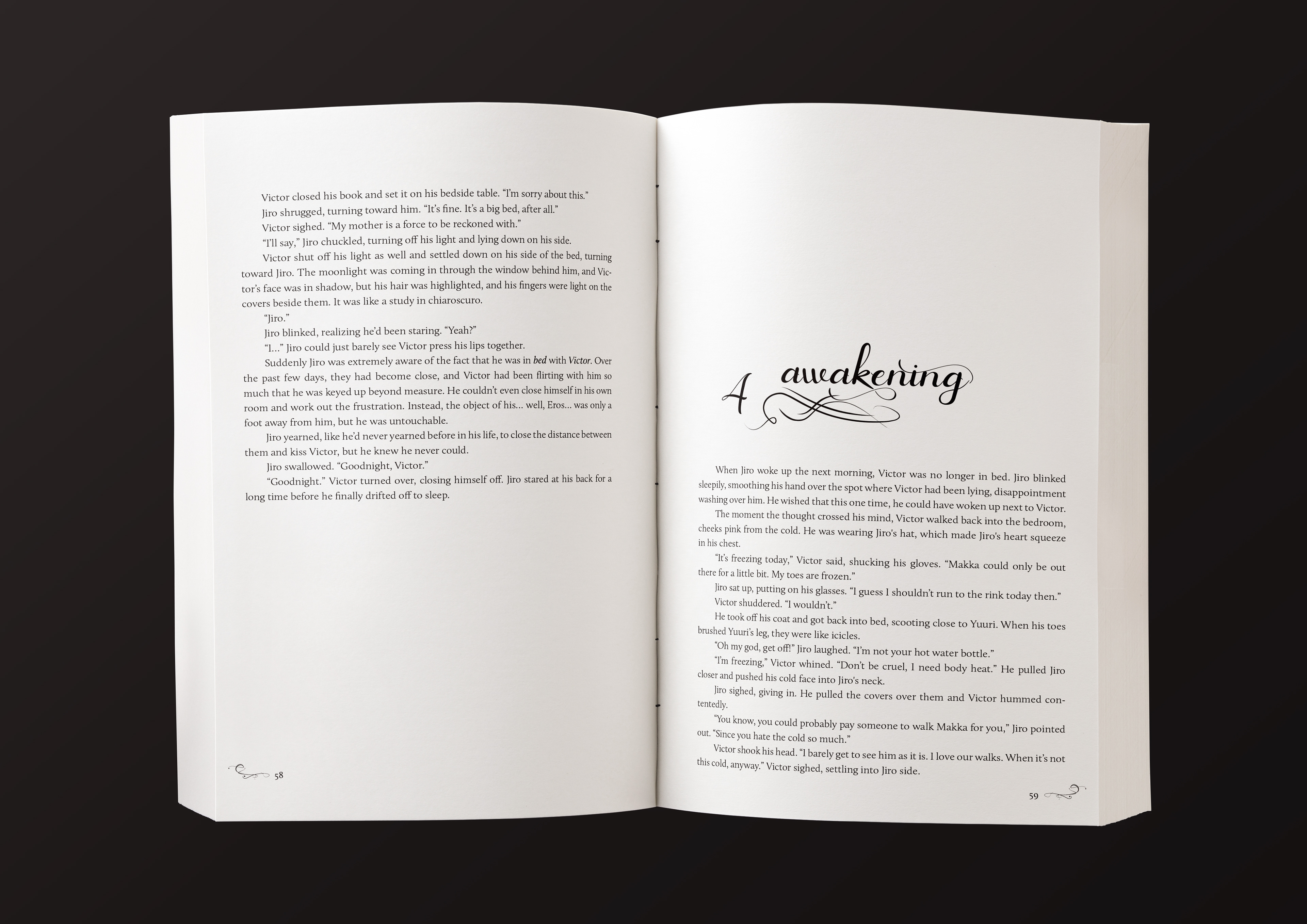
A romance between ice skaters, I selected the fonts to echo the lines left by figure skates on ice, while capturing the dreamy feel of whirlwind romance.
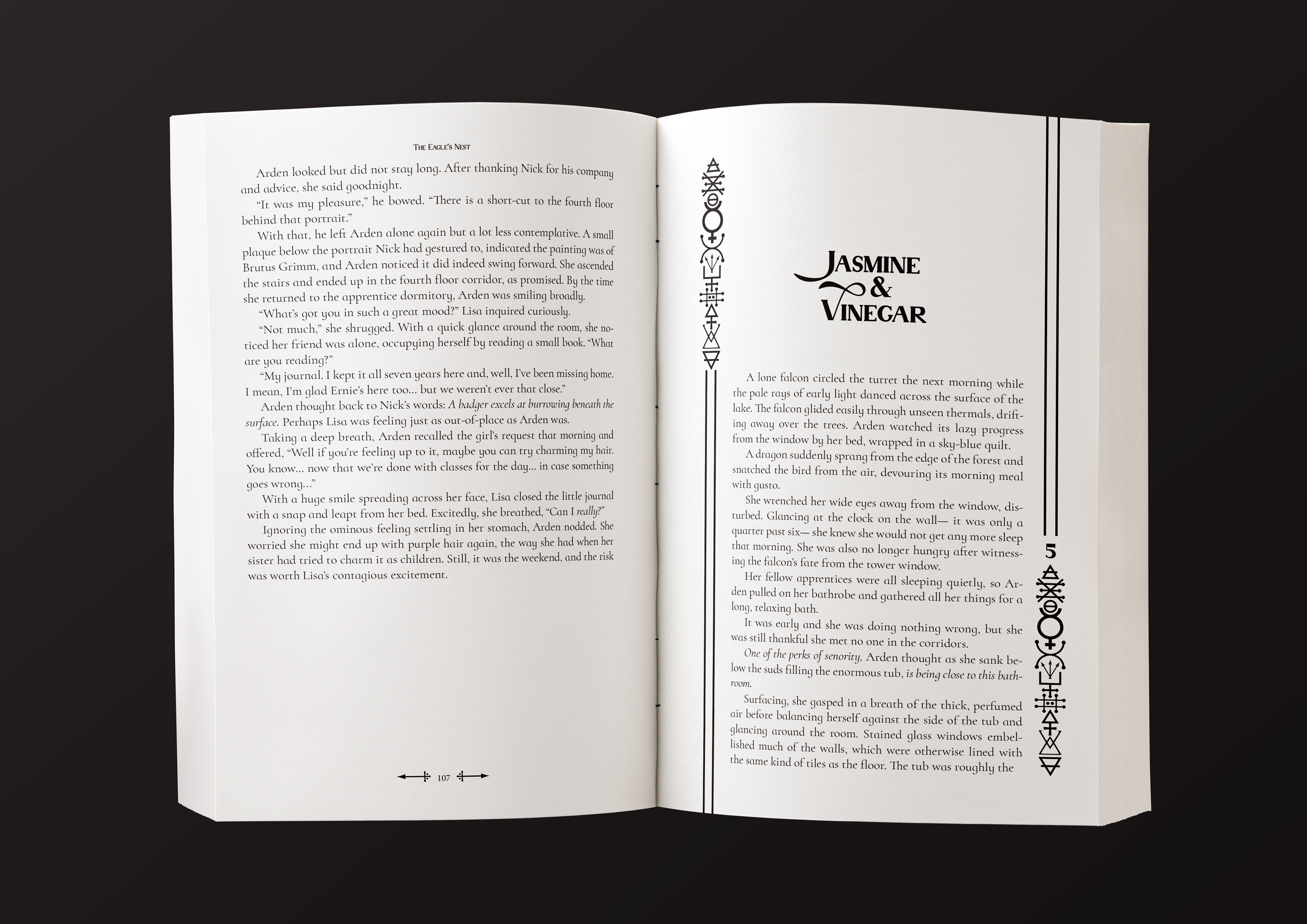
October 2021.
A fantasy story about alchemy students, and an experiment gone wrong. I incorporated alchemical symbols into the chapter headings, to keep with the feelings of an old alchemy text while also being clean and modern. The symbol for lead decorates the page numbers.
"Your style is perfect!" - Client
Fall 2021.
Medieval fantasy set in a high tower. I added the frame to capture both the elegance and confines of the setting.
Spring 2021.
A romance set in an academic library, the chapter headings are designed to invoke footnotes.